

Tech Crunch‘s New Web Design in 2009
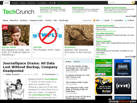
Tech Cruncgh also changed it’s design in last months. This time, they just edited their template instead of changing the whole design. Previous design was clear, but it wasn’t easy to click on a ad (even to see). This theme is “monetization-friendly”. 300X250 square ad at right is one of the most clicked ads in general. Narrow header made 728×90 header-ad more visible. Clever Move Tech Crunch! Post Written By Szjlajk (guest author)
Note: Homepage Design Smells like Gawker. Just check Gizmodo


One response to “Tech Crunch’s New Web Design in 2009 – Good But Smells Like Gizmodo [Screen Shot]”
While we are discussing about topics relevant to
Tech Crunch’s New Web Design in 2009 – Good But Smells Like Gizmodo [Screen Shot]
, Web designing is a process of designing the electronic files through planning, concepts, ideas, creativity, thinking, language etc, which is delivered via internet in the form of web site.